Project was part of identifying opportunity for enhancing UX of IG Trading Financial Charting package.
Worked alongside Stakeholders, Product owner and Development team.
Problem statement
Clients wanted to viewing chart on different timeframes/intervals to analyse market and define trends and patterns.
Challenge
Charting is heavy package and there were tech limitations on amount of streaming charts without not overloading web platform.
Process and first results
Defined requirements with stakeholders and technical team to ensure a comprehensive understanding of user needs, effective problem-solving, and successful implementation.
Gathered insights from usability sessions and from competitor research.
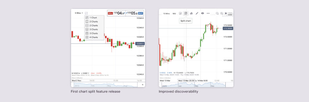
Identified the most useful chart view combinations and tested with dev team on chart load
In further platform user testing we have discovered that this feature had poor discoverability:
- People want this, they love it, but they can’t find it.
- They don’t see the selector.
- When it’s pointed out to them, they can’t guess what it is.
Challenge
How to educate users on platform interface without explaining each feature and tool.
Hypothesis
- The visibility and styling of the button is the main issue.
- There are other tools might be missed by clients.
Results and improvements
- I have created designs where more frequently used chart menu items moved from dropdown and placed on the top of chart.
- Added tooltip to chart tools buttons/icons to help users understand what tool is without guessing the icon.
- I looked at redesign the icon / button to look more interactive.
- We have asked analysts to use split chart feature in the materials they are publishing as an additional advertising of the tool